ShopDreamUp AI ArtDreamUp
Deviation Actions
Description
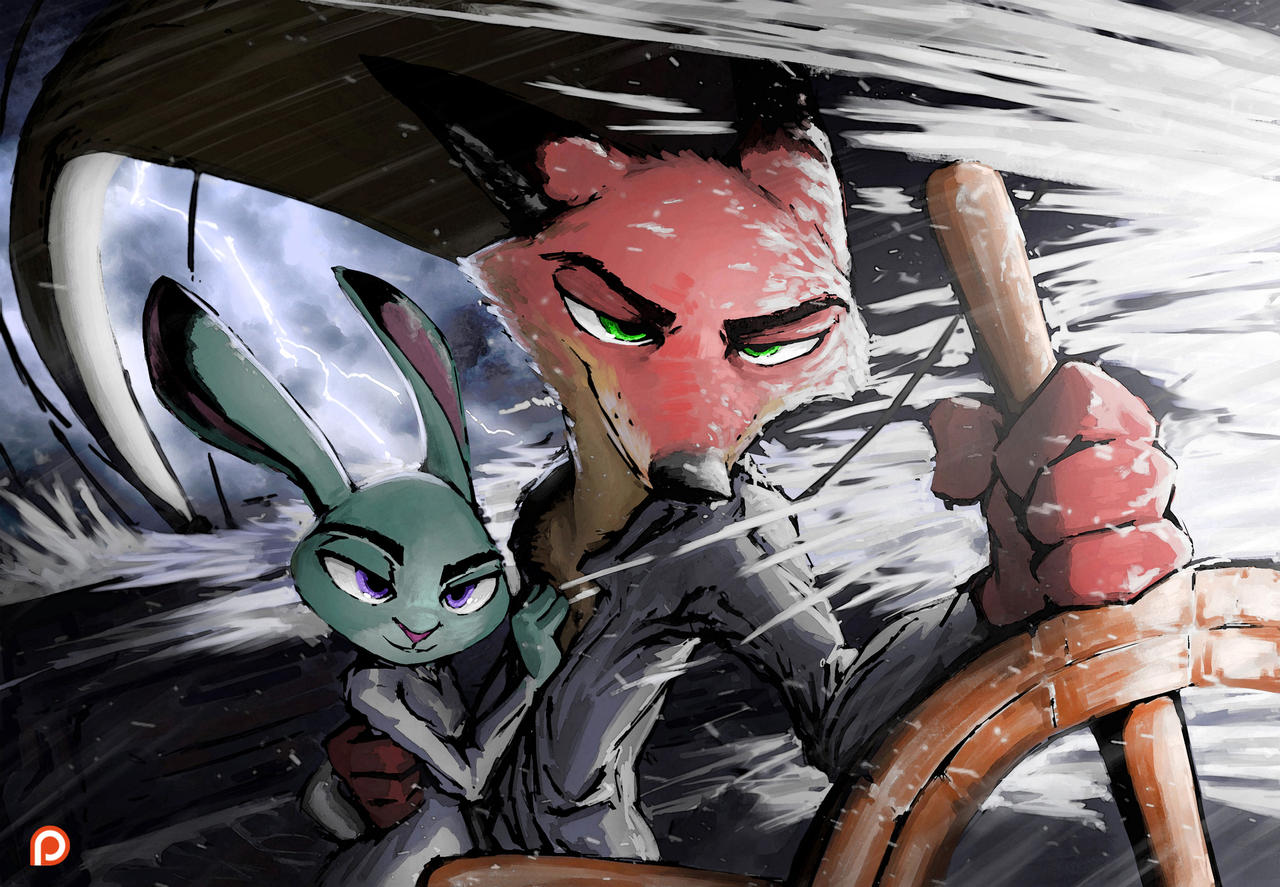
The fourth Patreon commission from the Best of the Best reward, for Rieth8998, tributing Selaxes work Tails of the High Seas.
Read the accompanying story of the image, by Kulkum, here!

(WARNING: Story contains sexual content)
And of course, if you wish to support me and Kul, check out our Patreon!

www.patreon.com/Sunderance
Read the accompanying story of the image, by Kulkum, here!

Like The Sea
Falling on the ship with a speed and force that he had only seen once before, the storm roared around the Night Howler with a savagery that only the angry sea could provide. Some sailors would wonder what ship or captain had angered the ocean so deeply that it would unleash such a typhoon, but the fox at the helm had no such illusions or superstitions. This was what it meant to live on the open sea; to ride the waves and savor the feeling of freedom that only came when the salty sea air ruffled the fur, a captain had to be ready to face the fury of the storm.
This was the most perfect example of that fury he could remember. The wheel struggled against his paws as the ship, tempted to go its own way by the strength of waves and current, resisted with enough strength that it made his arms ache and burn. Every moment of simply keeping the ship on course was a battle, one that was often lost as waves demanded attention. The monster wave movin
(WARNING: Story contains sexual content)
And of course, if you wish to support me and Kul, check out our Patreon!

www.patreon.com/Sunderance
Image size
3691x2557px 1.98 MB
© 2017 - 2024 TheWyvernsWeaver
Comments35
Join the community to add your comment. Already a deviant? Log In
Okay, let's see what we have here. This is my second critique (you propably read the first one <img src="e.deviantart.net/emoticons/b/b…" width="15" height="15" alt="
Vision: This is what strikes me most in almost all of your art. You just have an eye for illustration. You know how the characters need to be presented in the composition (both in terms of position in the frame and depth, as this one brilliantly exemplifies), and how to make their characters shine. Though to be fair, because you are very focused on Zootopia content you are by now very well accustomed to presenting Nick and Judy's characters. Judy has a confident smile, Nick has his typical fangirl-melting smirk, you know how they work C:
Originality: This is where I need to value unfairly, because not only is this fanart, but it's also what I like to call "Meta fanart"- fanart about fanstuffs. You are very often doing fanart for fanfictions, or other people's comics. And that is an awesome thing! Especially in a community, this stuff is pure gold, on a social level. And of course it should be mentioned that this is a commission. However, on an artistic level, the only thing that is "original" here is the presentation, which as I mentioned in the "vision" paragraph is awesome, but I don't think it applies here. So take my "final" grade in this with a grain of salt. I can't choose the cathegories for my critique <img src="e.deviantart.net/emoticons/let…" width="15" height="15" alt="
Technique: Okay, I think this is where I have most to say:
Firstly, lets acknowledge that brilliant fov! I love how the wheel is foreshortened in space, it makes the image much more dynamic. Although this makes what I suppose is the sail of the ship hard to identify. At first I thought it was a bridge of some sort to be honest. This one actually lacks an issue I have with a few of your drawings which I am gonna mention anyways, as a pointer. I think your biggest flaw is dynamic posing. One recent example where this is apparent is this: monoflax.deviantart.com/art/Dr…
Nick works in this shot, but Judy feels a bit off. Something about her stance feels unbalanced. Whats most important for natural poses is weight. You need to develop a feeling of a character's weight distribution to put them into space convincingly. As I said, this issue is not present here, mainly since the characters feet are out of frame, but I wanted to point it out for future reference. Look at Cory Loftis's character sketches (again and again!). He did some brilliant dynamic poses which are worth studying! Be sure to pay attention to how the feet are positioned, and how the limbs and spine all go together.
Now for the anatomy of Nick and Judy.
You got their size relation pretty realistically. You tend to make Nick's torso really slim, and while I think it looks a bit too strong for my taste in some cases, I actually think it's fine to exeggarate there because it fits the way you draw really well. However, I think that there is a more definite issue with the arms. They tend to be very long. Now, in this shot it is understandable for the right arm to look too large because of the foreshortening I mentioned before. but the left arm is where I run into a problem. I am not sure if the piece of cloth next to his hand is just a sleeve or actually his elbow. If its the latter, the arm is way too long, but even if it's just the sleeve its still a stretch(literally), because his shoulders indicate that his arm is at least partially tucked behind the back as seen from the viewer, but for their posing here to make sense it would have to be at least partially extended, which it isn't because then you would have to see hints of his arm next to Judy's other shoulder. This might be nitpicking, but its relevant to think of how all the parts of the body relate to each other, and not just the way they connect to each other. The position of the shoulder influences the arms, the curve of the spine flows organically into the postition of the legs, etc.
Their headshapes are also very different from canon material, but I will give you the benefit of the doubt here, since it is a shape you use very continuously for both Nick and Judy. Both shapes pronounce the cheeks of the character, but Judy's look a lot more rounded while Nick's are pointy. I suppose it is actually an element of characterization you used which was not in the original designs.
As for the painting, there really isn't much to critique here, I really like your colors (Although I still think your palette for Judy is just a bit too greenish) aswell as the rough but precise shading (which has become your trademark, at least concerning me) and both the lighting AND the literall lightning in the background look absolutely mindblowing. which leads us to...
Impact This work actually blew me away, I really felt the rough breeze of the sea while watching it, the dynamic of the weather and the boat which is fighting against that storm, the tidal waves spitting into their faces... it's all really cool. Upon further inspection this might have subconsciously inspired me with my most recent artwork of Toothless sitting on a rock, surrounded by tidal waves, in a storm, with a lightning in the background... huh. So as far as inspiration goes, YEAH it impacted me!
Even if I had to pick a nit here, it would be that the entirety of it looks a bit... cliche, which I am not sure of since it could very well be intended. I do not know, I didn't read the fanfiction to be honest.
And that's it. I went a little nuts with the technical nitpicks, but oh well. I hope you find this helpful.


:origin()/pre03/ead4/th/pre/f/2017/098/2/c/like_the_sea_by_kulkum-db544mn.jpg)